Email Accessibility
Email accessibility ensures that all recipients, including those with disabilities, can understand and interact with your content. Disabilities that may affect email use include visual, auditory, physical, and cognitive impairments.
By making your emails accessible, you improve the experience for all users and expand the reach of your communication.
Key Tips for Designing Accessible Emails
Here are some best practices for ensuring your emails are accessible:
Use a Simple Layout
- Keep your email layout straightforward and easy to navigate. Use a single-column design to ensure compatibility with screen readers and mobile devices.
- Avoid using complex tables for layout purposes, as these can confuse screen readers. Instead, use semantic HTML to organize content.
- Maintain a logical reading order from left to right, top to bottom, especially when using tables for layout. Avoid multi-column layouts that may be read in an unexpected order by screen readers.
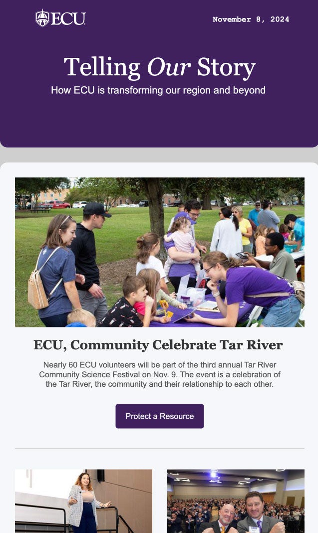
Example of Good Email Layout:

Why it’s good:
- Clear visual hierarchy using appropriate heading levels
- Accessible, easy to read fonts
- Good color contrast between text and backgrounds
- Short passages of text
- Descriptive text on buttons
Include Descriptive Alt Text for Images
- Add alt text for all images, ensuring that users relying on screen readers understand the message conveyed by the image. If the image is linked, provide context for where the link will take the user.
- Keep alt text concise but descriptive. If an image is purely decorative, use an empty alt attribute (alt=””) to prevent distraction.
- Ensure images with text are not the only method of conveying important information. Always include key information in the email body as well.
Example of Good and Bad Alt Text:

Good Alt Text:
“Students in a classroom, with a smiling student holding a green bag in the foreground.”
- Why it’s good: Brief but provides key details about the image’s context and focus.
Bad Alt Text:
- “A classroom.”
- Too vague.
- “A woman sitting at a desk.”
- Misses key details and context.
Write Clear and Descriptive Link Text
- Avoid generic link text like “click here” or “read more.” Instead, use descriptive text that provides context for where the link will take the user.
- Example: Instead of “Click here to view our services,” use “View our accessibility services.”
- Ensure links have unique, meaningful text that makes sense when read out of context by screen readers.
Use Proper Heading Structure
- Use headings to create a logical content hierarchy. This helps screen reader users navigate your email more easily.
- Ensure headings are used in a logical order, without skipping levels, to maintain clarity.
- Proper headings allow users to quickly jump to different sections of your email, making navigation more efficient.
Example of Accessible Heading Structure:
- H1: Email Title
- H2: Section title
- H3: Subsection Title
- H3: Another Subsection Title
- H2: Another Section Title
- H2: Section title
Ensure Sufficient Color Contrast
- Text should have sufficient color contrast against the background to be readable by users with visual impairments. Tools like the WebAIM Contrast Checker can help you test color combinations.
- Avoid using color alone to convey important information. Use text labels or symbols in addition to color.
- Test your email in color-blind simulators like Color Oracle to ensure readability for users with color vision deficiencies.
Button Color Contrast Examples:

Use Meaningful Button Labels
- Ensure buttons have descriptive labels that clearly explain their function. For example, use “Register for the Webinar” instead of just “Register.”
- Avoid using vague button text like “Submit” without context.
- Button labels should be action-oriented and provide a clear understanding of what will happen when clicked.
Provide a Text Version of Your Email
- Always include a plain text version of your email. This ensures that users who cannot access the HTML version can still read your message.
- Many email clients automatically generate a text version, but it’s best to customize it to ensure key information is conveyed clearly.
- Make sure the text version includes all important details, such as dates, times, and key links.
Avoid Animated GIFs or Provide Alternatives
- Animated GIFs can be distracting or inaccessible for users with cognitive disabilities or motion sensitivity. If you use GIFs, ensure the key information is also available in text.
- Provide a pause option for animations or limit looping to prevent distractions.
- Consider using static images if the animation is not crucial to the message.
Accessible Email Tools and Testing
- Accessibility Checkers: Use tools like WAVE or Litmus to check your email for accessibility issues before sending.
- Color Contrast Tools: Apps like Color Oracle for Mac, Windows, and Linux simulate how color-blind users perceive your message. Use the WebAIM Contrast Checker to ensure sufficient contrast.
- Screen Reader Testing: Test your email with screen readers like NVDA or VoiceOver to understand how it will be experienced by users relying on assistive technology.
Related Accessibility Topics
Creating accessible emails is just one part of ensuring inclusive communication. Learn more about related topics:
- Web Accessibility – Best practices for making web content accessible to all users.
- Video Accessibility – Learn how to make video content inclusive with captions, transcripts, and accessible controls.
- Document Accessibility – Tips for creating accessible documents, such as PDFs and Word files, that are usable by everyone.
- Social Media Accessibility – Best practices for making social media posts accessible, including alt text for images and captioned videos.
